![]()

Interior Design Presentation Board: Your Complete Guide to Creating Stunning Visual Pitches in 2026
Interior designers live and die by first impressions. When pitching a concept to a client, contractor, or collaborator, an interior design presentation board is the tool that transforms scattered ideas into a cohesive, persuasive visual story. It’s more than a collage, it’s a strategic layout that combines materials, colors, fixtures, and spatial concepts into one compelling snapshot of the finished space. Whether working with high-end residential clients or commercial developers, designers use presentation boards to align expectations, justify budgets, and secure approvals before a single wall gets painted or floor gets laid.
Key Takeaways
- An interior design presentation board combines materials, colors, fixtures, and spatial concepts into one compelling visual story that helps clients visualize abstract concepts and secure design approvals.
- Essential elements to include are color palettes with labeled paint samples, actual material and finish samples, furniture selections with dimensions, lighting fixtures, textiles, and clear labeling for sourcing accuracy.
- Choose between physical boards for high-touch, in-person client meetings where material quality matters, or digital boards using software like Canva or Adobe InDesign for flexibility, speed, and remote collaboration.
- Avoid overcrowding the layout, ignoring scale and proportion, using low-resolution images, and skipping labels—each design mistake can confuse clients and dilute the presentation board’s effectiveness.
- A successful presentation board requires a systematic process: define project scope, gather samples, choose your format, establish a layout grid, arrange elements with proper labeling, and review for cohesion before presentation.
What Is an Interior Design Presentation Board?
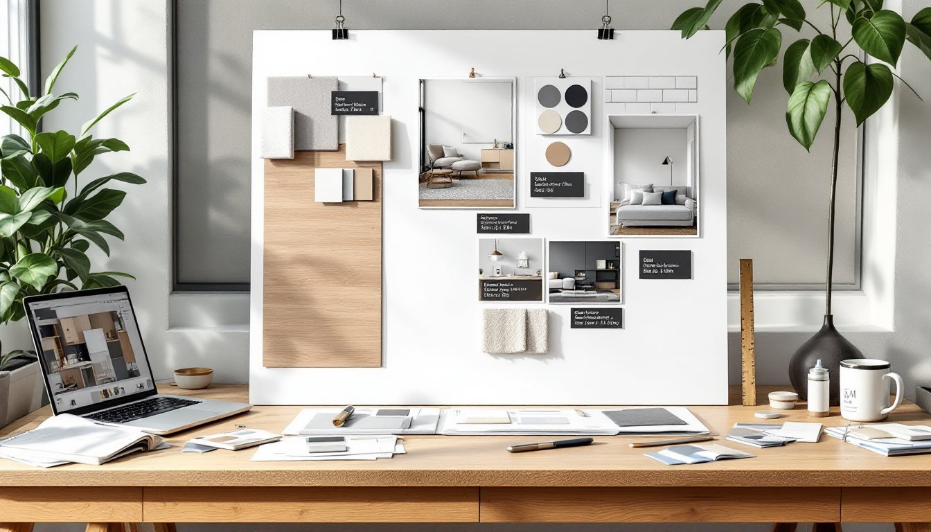
An interior design presentation board, often called a concept board or mood board, is a visual communication tool that displays all the key design elements for a project in a single, organized layout. Unlike a floor plan or elevation drawing, it focuses on aesthetics: finishes, furniture, lighting, textiles, and color palettes.
Designers use these boards during client meetings to demonstrate how individual selections work together. A typical board includes fabric swatches, paint chips, finish samples (like tile or wood flooring), photographs of proposed furniture, hardware examples, and lighting fixtures. Each element is carefully arranged to show proportion, contrast, and harmony.
Presentation boards serve multiple functions. They help clients visualize abstract concepts, provide a reference point for contractors and suppliers, and act as a design contract of sorts, documenting what was agreed upon before installation begins. In commercial projects, they’re often part of formal bid packages or permitting submissions.
The format varies. Traditional boards are physical, foam core, poster board, or pinned cork surfaces with actual material samples adhered or pinned on. Digital boards use design software to arrange scanned samples, product images, and renderings into a cohesive layout that can be emailed, presented on-screen, or printed.
Essential Elements to Include on Your Presentation Board
A well-constructed presentation board tells a complete story without overwhelming the viewer. Each element should have a purpose and contribute to the overall vision.
Color palette is the foundation. Include paint samples or color chips for walls, trim, ceilings, and accent areas. Label each with the manufacturer and color code (e.g., Benjamin Moore HC-172 Revere Pewter). Showing colors in relationship to one another reveals whether the scheme is cohesive.
Material and finish samples bring tactile reality to the design. Attach or photograph actual samples: flooring (hardwood, tile, vinyl plank), countertop materials, backsplash tile, cabinet door styles, and hardware finishes. Real samples show texture, sheen, and scale better than digital images alone.
Furniture selections anchor the spatial concept. Include product photos or sketches of key pieces: sofas, tables, beds, case goods. Note dimensions to show the client that pieces fit the space. Mixing styles requires intentional curation, so showing items together clarifies the aesthetic.
Lighting fixtures define mood and function. Display pendants, sconces, table lamps, and recessed can details. Specify finish (brushed nickel, matte black, aged brass) and note lumens or bulb type if relevant to energy codes.
Textiles and soft goods add warmth and layering. Include upholstery fabric swatches, drapery samples, area rug images, and throw pillow details. These elements humanize a space and often make or break a color scheme.
Inspiration images provide context. A single photo of a room with a similar vibe helps clients understand the direction without dictating every detail. Keep these minimal, one or two max.
Label everything. Clients won’t remember which gray is for the walls and which is for the trim. Clear, concise notation prevents costly errors during installation.
Physical vs. Digital Presentation Boards: Choosing the Right Format
The choice between physical and digital boards depends on the client, project scope, and presentation setting. Both have strengths.
Physical boards offer a tangible, high-touch experience. Clients can feel textures, see true color under room lighting, and compare samples side by side without screen glare. They work best for in-person meetings, showroom presentations, and high-end residential projects where material quality is paramount. Standard sizes are 20″ × 30″ or 24″ × 36″ mounted on foam core or gator board. Use spray adhesive or double-sided tape to secure samples, and protect the surface with a clear sleeve or laminate if it’ll be handled frequently.
Physical boards require more prep time. Designers must source, cut, and adhere samples, then transport the board without damage. They’re harder to revise, swapping a fabric swatch means rebuilding part of the layout.
Digital boards offer flexibility and speed. Software like Canva, Adobe InDesign, Photoshop, Morpholio Board, or SketchUp allows designers to arrange images, adjust layouts, and update selections in minutes. Digital formats are ideal for remote clients, fast-paced commercial projects, and teams collaborating across locations. They can be shared via email, presented on a tablet during site visits, or printed on demand.
The downside: screens don’t always render color accurately, and clients can’t touch materials. For projects where finish quality matters, custom tile work, luxury textiles, specialty wood species, digital boards should be supplemented with physical sample kits sent separately.
Many designers use a hybrid approach: create the layout digitally for easy editing and client approvals, then print a final version and mount key physical samples on top for presentations. This balances efficiency with the tactile credibility clients expect.
Step-by-Step Process for Creating an Effective Presentation Board
Building a presentation board is part curation, part storytelling. Follow this process for clarity and impact.
1. Define the project scope and style direction. Before selecting anything, confirm the room(s) involved, budget range, and design style. A modern farmhouse kitchen board looks different from a mid-century living room.
2. Gather materials and samples. Order paint chips, fabric swatches, tile samples, and product cut sheets. Photograph or download images of furniture and fixtures. Collect everything in one place, physical samples in a labeled folder, digital assets in a project folder.
3. Choose your format and dimensions. Decide physical or digital, and set the board size. For physical, cut foam core to 20″ × 30″. For digital, set up an artboard in your software at 11″ × 17″ (tabloid) or 18″ × 24″ for printing.
4. Establish a layout grid. Avoid random placement. Use a grid or alignment guides to organize elements into zones: top row for color palette, middle for materials and finishes, bottom for furniture and fixtures. Leave white space, crowding kills readability.
5. Arrange and secure elements. Place the largest or most important items first (e.g., flooring sample, main paint color), then build around them. In physical boards, use 3M Super 77 spray adhesive or mounting squares. In digital, layer images and add subtle drop shadows for dimension.
6. Add labels and annotations. Use a simple sans-serif font. Include product names, manufacturers, item numbers, and dimensions where relevant. Don’t clutter, just enough info for sourcing and clarity.
7. Review for cohesion. Step back. Do colors clash? Is the scale consistent? Does the board reflect the agreed style? Adjust as needed.
8. Protect and present. Slip physical boards into a clear presentation sleeve or laminate them. Export digital boards as high-res PDFs (300 dpi) for printing or screen sharing. Bring backup samples to meetings in a small kit.
Common Mistakes to Avoid When Designing Your Board
Even experienced designers slip up. Watch for these pitfalls.
Overcrowding the layout. More isn’t better. Including every option confuses clients and dilutes the concept. Select the hero pieces and supporting elements: leave alternatives for a separate options sheet.
Ignoring scale and proportion. A tiny fabric swatch next to a huge furniture photo skews perception. Keep sample sizes relatively balanced, or group small items together.
Using low-resolution images. Blurry product photos look unprofessional and make it hard to assess detail. Always use high-res images, especially for print boards.
Skipping labels. Clients won’t remember which beige is the wall color and which is the sofa fabric. Label everything with source and identifier.
Inconsistent lighting in photos. Mixing product shots taken under different lighting conditions makes colors look mismatched, even if they’re not. Adjust white balance in editing software or note discrepancies.
Neglecting the client’s input. A board that ignores the client’s stated preferences, no matter how beautiful, will get rejected. Build in their must-haves and work around them.
Forgetting context. Show samples in a way that reflects how they’ll be used. A countertop sample should be large enough to show veining or pattern repeat: a paint chip should be at least 2″ × 2″ to read true color.
Best Tools and Software for Professional Presentation Boards
The right tools streamline the process and elevate the final result.
For physical boards:
- Foam core or gator board (20″ × 30″ or 24″ × 36″) provides a rigid, lightweight backing.
- Spray adhesive like 3M Super 77 bonds samples cleanly without warping.
- X-Acto knife and cutting mat for trimming samples and images to size.
- Clear presentation sleeves protect finished boards during transport.
For digital boards:
- Canva is beginner-friendly with drag-and-drop templates and a massive image library. Free and paid tiers available.
- Adobe InDesign offers precise layout control, typography tools, and print-ready export options. Industry standard for print design.
- Morpholio Board is purpose-built for interior designers, with a mobile app for iPad that mimics pinning physical samples. Intuitive and fast.
- SketchUp + Layout works well for designers already modeling spaces in 3D: Layout creates annotated presentation sheets.
- Photoshop handles complex image editing and compositing but has a steeper learning curve for layout work.
Sample sourcing:
- Order physical samples from manufacturers (most offer free designer samples).
- Use Material Bank for fast, free sample delivery if you qualify for trade access.
- Download product images from manufacturer websites or Houzz, Wayfair, and similar retailers.
Invest in a color-calibrated monitor if working digitally. Colors shift between screens and printers: calibration reduces surprises.
Conclusion
An interior design presentation board is more than eye candy, it’s a working document that aligns vision, budget, and execution. Whether assembling foam core and fabric swatches or composing a digital layout in Canva, the goal stays the same: translate ideas into a format clients can see, touch, and approve with confidence. Nail the details, label everything, and keep it cohesive. That’s how designers turn concepts into built spaces.