![]()

Interior Design Questions Answered: Your Complete Guide to Creating Beautiful Spaces in 2026
Interior design isn’t just about making a room look pretty, it’s about creating functional, comfortable spaces that reflect the people living in them. Whether someone’s starting from scratch in a new home or refreshing a tired room, the same questions keep coming up: How do I find my style? What colors work together? Can I really make that cramped bedroom feel bigger? This guide tackles the most common interior design questions with practical answers that translate into real results. No fluff, no vague inspiration boards, just straightforward guidance for making smart design decisions that improve everyday living.
Key Takeaways
- Interior design questions about hiring designers should address credentials, services offered, fee structure, communication style, and references to prevent mismatched expectations.
- Determining your interior design style starts with auditing what already works, identifying patterns in saved images, and testing designs before committing to ensure your space reflects how you actually live.
- Seven foundational elements—space, line, form, light, color, texture, and pattern—work together to create functional and visually balanced rooms.
- Small spaces appear larger through light colors, maximized natural light, strategic mirrors, appropriately scaled furniture, and minimal clutter that creates visual breathing room.
- Color palette selection becomes straightforward using the 60-30-10 rule, starting with a fixed anchor element, considering undertone consistency, and testing samples in multiple lighting conditions.
- Mixing patterns and textures successfully requires varying scale, maintaining a cohesive color story, balancing busy elements with calm spaces, and layering complexity gradually before committing.
What Should I Ask an Interior Designer Before Hiring?
Hiring a designer can feel like a leap of faith, but the right questions upfront prevent mismatched expectations and budget surprises.
Start with credentials and scope. Ask if they hold any certifications (like NCIDQ or ASID membership) and whether they carry liability insurance. Some states require licensing for specific work. Clarify what services they offer, full-service designers handle everything from space planning to contractor coordination, while decorators focus on finishes and furnishings without touching structural elements.
Get specific about the process. How many revision rounds are included? Do they charge hourly, flat-rate, or percentage-based fees? Will they provide 3D renderings or just mood boards? Ask if they mark up materials or earn trade discounts that get passed along. Transparency here matters.
Discuss communication style and timelines. How often will they check in? Who manages contractor relationships if walls are moving? What happens if the project runs over budget or schedule?
Finally, ask for references and photos of completed projects similar in scope and style. A designer who’s great with modern lofts might struggle with a traditional farmhouse renovation. Chemistry counts, this person will be making decisions about the most personal spaces in the home.
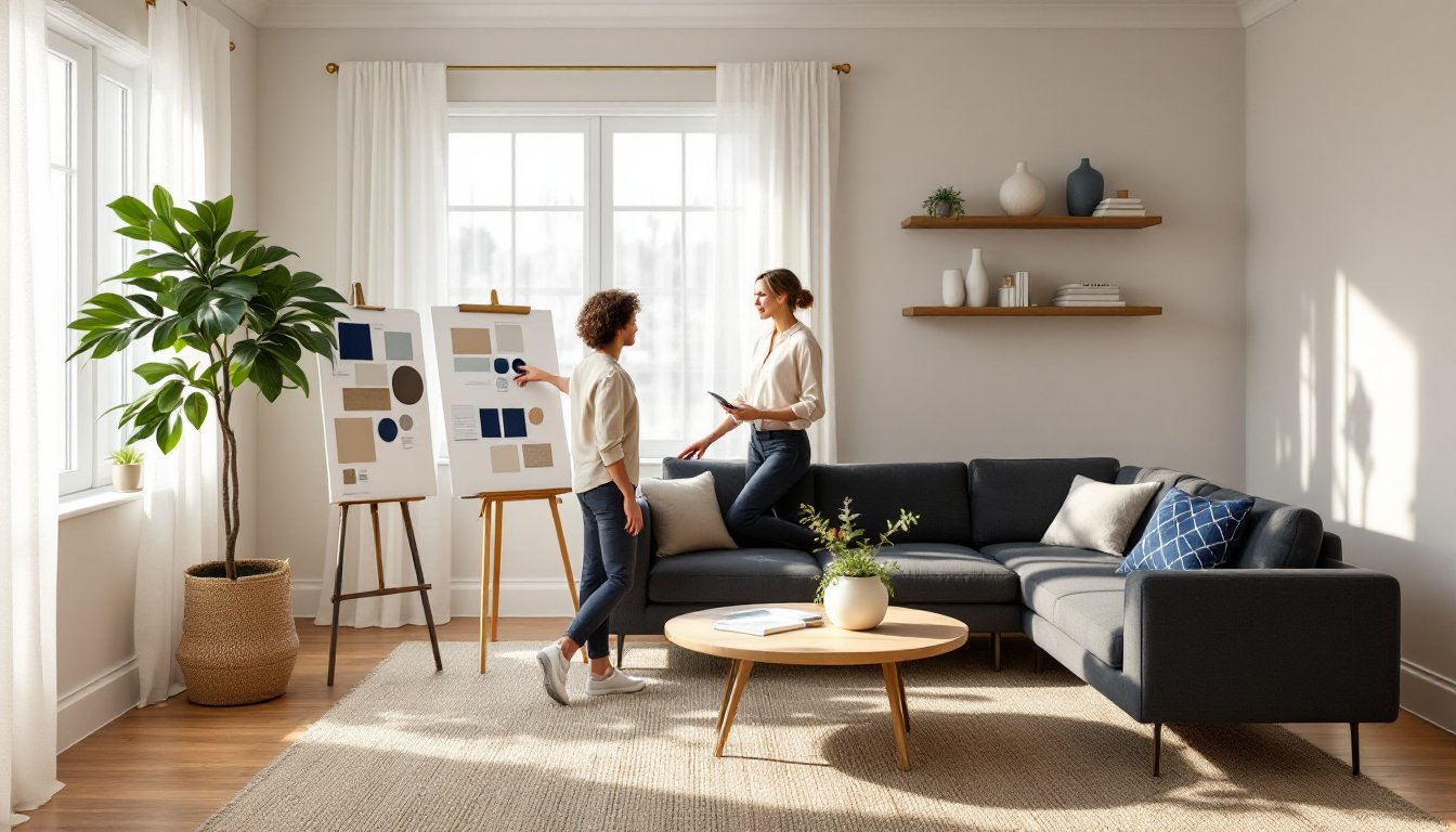
How Do I Determine My Interior Design Style?
Personal style isn’t about picking a label from a magazine, it’s about identifying what actually feels comfortable and looks right to the person living there.
Start with an audit. Walk through the home and note what’s already working. Is there a favorite chair that gets used every day? A paint color that lifts the mood? A rug that ties everything together? Those aren’t accidents, they’re clues.
Look at saved images. Most people have a camera roll or Pinterest board full of spaces they love. Lay them out side by side and look for patterns. Are most rooms filled with clean lines and neutral tones (modern/minimalist), or layered textures and warm woods (rustic/transitional)? Repeated elements reveal preferences.
Consider lifestyle honestly. A pristine white sofa doesn’t fit a household with muddy dogs and kids who eat snacks on the couch. A formal dining room that never gets used wastes space. Style should support how people actually live, not how they think they should.
Test before committing. Paint samples on walls look different than chips at the store. Furniture arranging apps (or blue painter’s tape on the floor marking footprints) show whether that oversized sectional will dominate the room.
Style can evolve and blend. Mixing modern furniture with vintage accessories creates an eclectic look that feels collected, not decorated. The goal isn’t perfection, it’s coherence.
What Are the Most Important Elements of Interior Design?
Seven foundational elements work together to make a space functional and visually balanced. Ignore one and the room feels off, even if the cause isn’t immediately obvious.
Space refers to both the physical footprint and how it’s divided. Positive space holds furniture and objects: negative space is the breathing room around them. Cramming too much into a room creates visual clutter. Leaving too much empty makes it feel unfinished.
Line guides the eye and defines style. Horizontal lines (in tables, shelves) suggest stability and calm. Vertical lines (tall bookcases, floor-to-ceiling curtains) add height and formality. Diagonal or curved lines introduce energy and softness.
Form is the shape of objects, furniture, lighting, architecture. Mixing geometric (square coffee tables) and organic forms (rounded planters) adds interest without chaos.
Light affects everything. Natural light changes throughout the day and should be layered with ambient (overhead fixtures), task (reading lamps), and accent lighting (picture lights, under-cabinet strips). Dimmer switches add flexibility.
Color sets mood and ties elements together. The 60-30-10 rule (60% dominant color, 30% secondary, 10% accent) creates balance without monotony.
Texture adds depth through materials, smooth leather, nubby linen, rough jute, glossy metal. Mixing textures prevents flat, one-note spaces.
Pattern injects personality but requires restraint. Vary scale (large floral, small geometric, solid) and limit to three patterns per room to avoid visual overload.
Balancing these elements takes practice, but understanding them makes decorating decisions clearer.
How Can I Make a Small Space Look Bigger?
Small rooms don’t have to feel cramped. Strategic design tricks manipulate perception and maximize usable space.
Start with light colors. Whites, soft grays, and pale blues reflect light and recede visually, making walls feel farther away. Painting trim and walls the same color eliminates visual breaks that chop up space.
Maximize natural light. Remove heavy drapes and swap them for sheer panels or cellular shades that filter light without blocking it. Clean windows regularly, grime reduces light transmission more than most people realize.
Use mirrors strategically. A large mirror opposite a window doubles perceived light. Mirrored closet doors or a leaning floor mirror expand sightlines. Avoid mirror overload, which creates a funhouse effect.
Choose furniture carefully. Pieces with exposed legs (sofas on tapered legs vs. skirted styles) show more floor, creating an airier feel. Glass or acrylic tables disappear visually. Wall-mounted shelving eliminates bulky bookcases.
Scale matters. Oversized furniture in a small room is suffocating, but too-small pieces look scattered and insubstantial. Measure carefully and use painter’s tape to map furniture footprints before buying.
Vertical storage saves floor space. Tall, narrow shelving draws the eye up and maximizes storage without sprawl.
Keep it minimal. Every object competes for visual attention. Editing down to essentials and using hidden storage (ottomans with lift tops, beds with drawers) reduces clutter.
These tactics work together, light color plus good lighting plus smart furniture equals a room that breathes.
What’s the Best Way to Choose a Color Palette?
Color decisions intimidate more DIYers than almost any other design choice, but a systematic approach removes the guesswork.
Start with a fixed element. Flooring, countertops, tile, whatever isn’t changing becomes the anchor. Pull colors that complement rather than clash with it.
Use the 60-30-10 rule as a framework. The dominant color (60%) covers walls and large furniture. The secondary color (30%) shows up in upholstery, curtains, or accent walls. The accent color (10%) pops in pillows, art, and accessories.
Consider undertones. Grays lean blue (cool), green (griege), or purple. Whites can be stark, creamy, or peachy. Undertones must harmonize, mixing cool and warm neutrals creates muddiness, not sophistication. Test paint samples in different lights (morning, afternoon, evening, artificial) before committing to full gallons.
Borrow from nature. Colors found together outdoors, sky and sand, forest greens with earth browns, almost always work together indoors.
Limit the palette. Three to five colors max (including neutrals) creates cohesion. Too many colors feel chaotic. Repeating the same accent color in different rooms ties the home together visually.
Test with temporary items first. Throw pillows, artwork, or a rug in the proposed palette shows whether colors work together before painting walls or reupholstering furniture.
Don’t fear color, but respect its power. A bold accent wall energizes: painting every wall deep navy shrinks the room. Balance is key.
How Do I Mix Patterns and Textures Without Overwhelming a Room?
Pattern and texture add visual interest, but too much creates chaos. The trick is controlled variety.
Vary the scale. Pair a large-scale floral with a medium geometric and a small-scale stripe or dot. Same-size patterns compete for attention and look busy.
Stick to a color story. Patterns in coordinating colors (not necessarily matching) unify the room. A blue-and-cream stripe plays well with a blue-and-gray paisley because they share the blue thread.
Balance busy with calm. If the sofa has a bold pattern, keep curtains solid or subtly textured. Patterned wallpaper pairs better with solid upholstery. Give the eye places to rest.
Mix pattern types. Stripes, florals, geometrics, and organic prints each have a distinct rhythm. Combining different types (not three different florals) creates richness without redundancy.
Texture works the same way. Smooth (glass, metal, polished wood) needs rough (jute, linen, matte ceramics) for balance. A room of all-smooth or all-rough textures feels flat.
Layer gradually. Start with one bold patterned piece, then add supporting players. It’s easier to add complexity than to edit down an overstuffed room.
Use solids as buffers. Solid pillows or throws between patterned ones provide visual breaks. A solid rug grounds patterned furniture.
When in doubt, test it. Drape fabric samples together or arrange pillows before committing. Pattern mixing is forgiving as long as scale varies and colors coordinate.
Conclusion
Good interior design isn’t about following rules perfectly, it’s about asking the right questions and making informed choices that fit the space and the people using it. Whether hiring a designer, defining personal style, or tackling color and pattern decisions, the foundation is the same: plan carefully, test before committing, and prioritize function alongside aesthetics. Spaces that look good and work well don’t happen by accident.