![]()

Minimalist Wabi Sabi Interior Design: Create Serene Spaces With Imperfect Beauty
Minimalist wabi sabi interior design merges the Japanese philosophy of finding beauty in imperfection with the clean simplicity of minimalism. Unlike sterile modern spaces, this approach celebrates natural wear, organic textures, and handmade objects that tell stories. It’s not about expensive renovations or designer furnishings, it’s about intentional editing, honest materials, and spaces that breathe. For homeowners tired of disposable trends and fussy décor, wabi sabi offers a practical path to rooms that feel grounded, authentic, and effortlessly calm.
Key Takeaways
- Minimalist wabi sabi interior design celebrates natural imperfections, organic textures, and honest materials instead of sterile perfection, offering homeowners an authentic alternative to disposable design trends.
- The core principles of wabi sabi—simplicity, naturalness, and impermanence—require ruthless editing, aging-friendly materials like solid wood and natural fibers, and acceptance that wear and patina are features rather than flaws.
- Effective wabi sabi color schemes use warm neutrals, muted earth tones, and soft grays with matte finishes, while avoiding high-contrast and saturated colors that clash with the style’s calm, introspective nature.
- Incorporate wabi sabi gradually through decluttering, swapping synthetic materials for natural textiles, introducing handmade items, and adjusting lighting to warm tones that enhance texture and create layered light sources.
- Success with minimalist wabi sabi requires avoiding common pitfalls like confusing it with shabby chic, over-accessorizing, choosing mass-produced ‘imperfect’ items, and neglecting practical function in pursuit of aesthetics.
What Is Wabi Sabi Interior Design?
Wabi sabi is a Japanese aesthetic rooted in accepting transience and imperfection. “Wabi” refers to simplicity and rustic beauty, while “sabi” speaks to the elegance of aging and wear. In interior design, this translates to spaces that honor natural materials, handmade imperfections, and the patina of time.
Unlike Scandinavian minimalism, which tends toward bright whites and streamlined forms, wabi sabi leans into earthy tones, weathered surfaces, and irregular shapes. A dining table with visible wood grain and minor surface cracks fits this philosophy better than a glossy lacquered finish. It’s about showcasing authenticity rather than concealing it.
Modern wabi sabi interior design adapts these principles for contemporary homes. The focus remains on reducing clutter and prioritizing function, but with warmer, more textured elements than typical minimalism. Think raw plaster walls instead of flat paint, handmade ceramics instead of uniform dishware, and vintage textiles rather than factory-fresh fabrics. The goal isn’t perfection, it’s presence.
Core Principles of Minimalist Wabi Sabi Style
The marriage of minimalism and wabi sabi rests on three pillars: simplicity, naturalness, and impermanence. Each informs choices from layout to lighting.
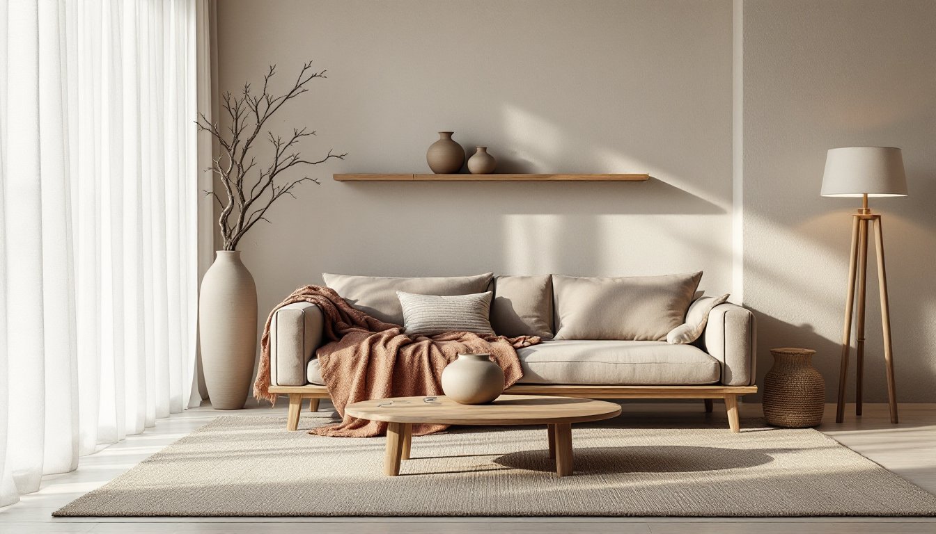
Simplicity means editing ruthlessly. Fewer pieces, more breathing room. A wabi sabi living room might feature a low-profile sofa, a single vintage rug, and a reclaimed wood coffee table, no gallery walls, no tchotchkes. Every object should serve a purpose or carry emotional weight.
Naturalness demands materials that age gracefully. Avoid plastic laminate, synthetic fibers, and mass-produced finishes. Instead, favor solid wood, stone, linen, wool, clay, and metal with visible oxidation. These materials develop character over time, which aligns with wabi sabi’s embrace of impermanence.
Impermanence acknowledges that nothing lasts forever. Scratches on a wood floor, a patched ceramic bowl, or faded upholstery fabric aren’t flaws, they’re evidence of a life lived. This principle discourages hyper-protective attitudes toward furniture and finishes. If something can’t handle daily use, it doesn’t belong in a wabi sabi home.
Embracing Natural Materials and Textures
Texture is the language of wabi sabi. Smooth surfaces feel anonymous: uneven ones invite touch and attention. Lime plaster or Venetian plaster walls offer subtle irregularity that flat drywall can’t match. If re-plastering isn’t in the budget, consider leaving brick or concrete exposed, seal it with a matte penetrating sealer (look for products rated for interior masonry) but don’t paint over it.
Wood should look like wood. Skip stains that mimic other species: let oak be oak and pine be pine. Reclaimed lumber, old barn boards, salvaged beams, or deconstructed pallet wood, brings built-in history. Just check for nails, treat for insects if sourced outdoors, and sand any splintered edges before use.
Natural fiber textiles add warmth without visual noise. Linen curtains, jute area rugs, wool throw blankets, all age beautifully and feel substantial underfoot or in hand. Avoid synthetics that pill or fade unevenly: cotton, hemp, and silk wear honestly.
Stone and clay ground a space literally and visually. A single ceramic vase, a slate tray, or a stone mortar and pestle becomes a focal point through weight and texture alone. Handmade pottery with visible thumb prints or uneven glaze fits better than machine-perfect porcelain.
Color Palettes That Embody Wabi Sabi Minimalism
Wabi sabi color schemes pull from earth, stone, and plant life. Think warm neutrals, muted greens, soft grays, and weathered browns. High-contrast palettes and saturated primaries clash with the style’s quiet, introspective nature.
Start with off-whites and warm grays as base tones. Benjamin Moore’s “Swiss Coffee” or Farrow & Ball’s “Skimming Stone” capture the slightly imperfect warmth wabi sabi requires, pure white feels too clinical. For accent walls or millwork, consider clay tones like terracotta, ochre, or dusty rose. These hues reference natural pigments and age gracefully as light shifts throughout the day.
Greens should be muted, sage, olive, or celadon rather than kelly or lime. These tones harmonize with wood and stone without demanding attention. Charcoal and slate grays work for textiles or smaller furnishings, adding depth without heaviness.
Avoid glossy finishes. Matte or eggshell paints (under 10% sheen) prevent surfaces from looking too slick or new. When selecting paint, test samples in the actual room lighting, north-facing rooms skew cooler, south-facing warmer, and observe how the color behaves at different times of day.
Color consistency matters less in wabi sabi than tonal harmony. A room with cream walls, a taupe sofa, a rust-colored throw, and a charcoal rug can feel cohesive if all tones share earthy undertones. Trust the eye, not the color wheel.
How to Incorporate Wabi Sabi Into Your Home
Transitioning to minimalist wabi sabi doesn’t require gutting rooms or buying all-new furniture. Small, intentional changes create the effect.
Start by decluttering. Remove anything that doesn’t serve a function or hold personal meaning. This isn’t Marie Kondo sorting, it’s tactical editing. If the bookshelf holds books you’ll never reread and décor you bought on impulse, clear it. Leave a few well-loved volumes and one meaningful object.
Replace synthetic materials gradually. Swap polyester curtains for linen panels, trade a plastic side table for a solid wood stool, or replace a nylon rug with wool or jute. Each swap adds tactile richness.
Expose structural elements where practical. If you’re renovating, consider leaving ceiling beams visible, exposing brick during a demo, or installing open wood shelving instead of upper cabinets. Structural honesty is a wabi sabi hallmark. Check local building codes before removing any walls or altering load-bearing elements, some changes require permits or engineering approval.
Introduce handmade items. A thrown pottery bowl, a hand-carved wooden spoon, or a woven wall hanging brings human presence into the space. Imperfections in these objects, uneven edges, slight warps, color variation, are features, not flaws.
Adjust lighting to suit the mood. Overhead LEDs with high color temperatures (5000K+) feel harsh. Opt for warm white bulbs (2700K-3000K) and use multiple light sources, table lamps, floor lamps, wall sconces, to create layers. Dimmer switches (standard rotary or slide models work fine: no smart tech required) let occupants control intensity.
Furniture and Decor Choices for Wabi Sabi Interiors
Furniture should be low-profile, solid, and simple. Platform beds, leggy sofas with exposed wood frames, and dining tables with visible joinery all align with the aesthetic. Avoid ornate carvings, tufted upholstery, or anything chrome-plated. Solid wood furniture in oak, walnut, or ash ages better than veneer or particleboard. If budget’s tight, buy secondhand, scratches and dings add character.
Seating can mix materials: a linen-upholstered armchair, a rattan side chair, a leather pouf that’ll develop patina. Prioritize comfort and durability over showroom looks. Test joints and frame stability on used pieces, wobbly legs mean repairs ahead.
Storage should be minimal and functional. Open shelving, wooden crates, woven baskets, or a single chest of drawers. Built-ins work if they’re simple, skip crown molding and fancy trim. Floating shelves (use heavy-duty brackets rated for the load, typically ½” × 2″ steel L-brackets anchored into studs) display a curated few items without bulk.
Décor is where restraint separates wabi sabi from rustic kitsch. One ceramic vessel on a mantel beats a cluster of five. A single branch in a tall vase reads as sculptural: a bouquet of faux florals does not. Mirrors should have simple frames or no frames, just a beveled edge. Avoid anything glittery, branded, or themed.
Common Mistakes to Avoid When Designing With Wabi Sabi
Confusing wabi sabi with shabby chic. Distressed finishes and deliberate aging aren’t the same as natural wear. Don’t sand furniture edges or apply crackle paint to mimic patina, it looks forced. Let time do the work.
Over-accessorizing. More isn’t more in this style. If every surface holds a candle, a bowl, and a stack of coffee table books, the space loses its calm. Edit down to a few meaningful pieces.
Ignoring function. Minimalism without usability is just an empty room. A wabi sabi kitchen still needs adequate prep space, storage, and task lighting. Aesthetic doesn’t override practicality.
Choosing trendy “imperfect” items. Mass-produced pottery stamped to look handmade or factory-distressed wood that’s actually laminate defeats the philosophy. Seek out actual artisan work or genuinely aged materials, even if it means buying less.
Neglecting maintenance. Natural materials require care. Wood needs occasional oiling (mineral oil or beeswax-based products work for most species), stone needs sealing (use a penetrating sealer, not a topical coating), and linen wrinkles, which is fine, but it also stains. Wabi sabi embraces wear, not neglect.
Forgetting about light. A room with beautiful textures but harsh fluorescent lighting won’t feel serene. Invest in warm-toned bulbs and layered light sources. Consider the orientation of windows, south-facing rooms flood with light and can handle deeper tones: north-facing spaces need lighter palettes to avoid feeling dim.
Skipping the edit. Minimalism is the skeleton that lets wabi sabi breathe. Without it, the aesthetic collapses into clutter. Regularly assess each room: does every object belong? If not, remove it.